Star Wars Logo: History, Evolution, Designers & Meaning Behind the Icon
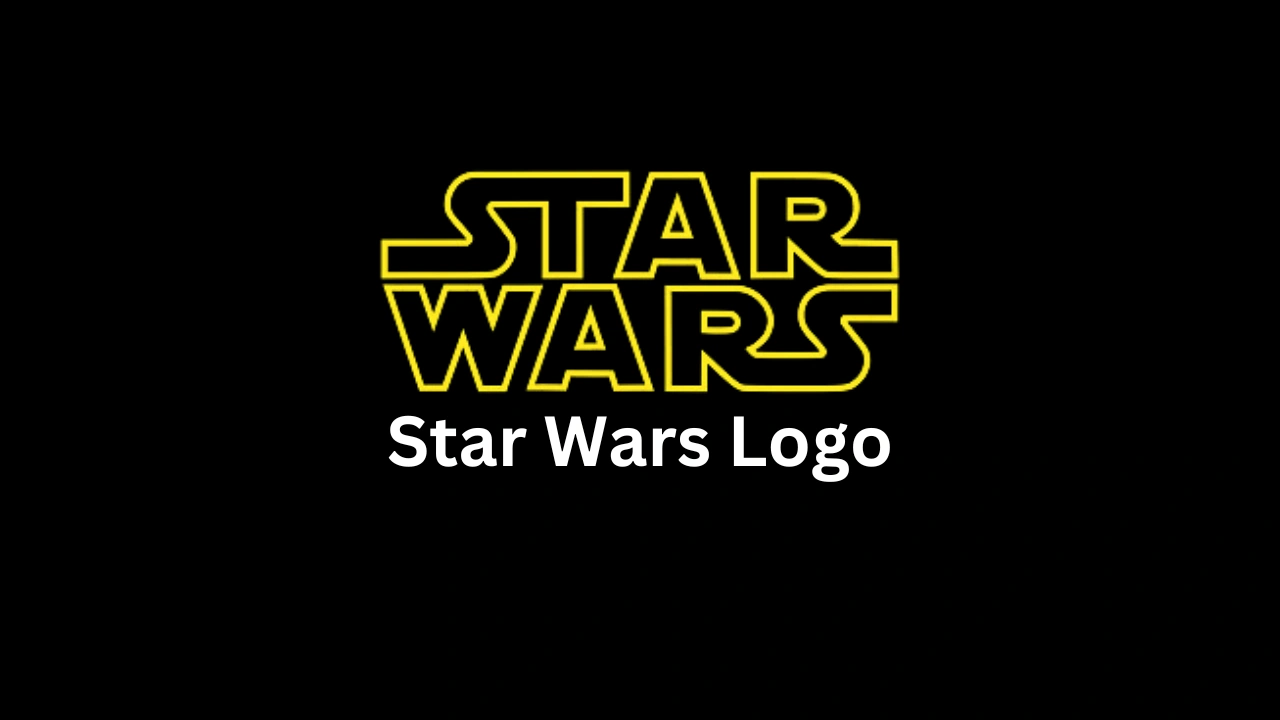
Few logos in entertainment history have achieved the universal recognition of the Star Wars logo. From its bold yellow letters bursting onto the screen in 1977 to its sleek modern adaptations across new films, toys, and streaming shows, the Star Wars wordmark has become more than a brand — it’s a visual shorthand for an entire galaxy of imagination.
In this post, we’ll explore the full evolution of the Star Wars logo — who designed it, how it’s changed over nearly five decades, what makes it visually powerful, and what you can (and can’t) do with it legally.
(Estimated reading time: 8 minutes)
Who Designed the Star Wars Logo?
The story of the Star Wars logo begins in 1976, almost a year before A New Hope hit theaters. George Lucas wanted a logo that looked bold, militaristic, and timeless.
He asked Suzy Rice, a young designer at Seiniger Advertising, to create a title logo that looked, in his words, “very fascist” — meaning clean, authoritative, and reminiscent of power. Rice later said she took inspiration from German industrial design and Helvetica Black, emphasizing symmetry and bold geometry.
Rice’s version became the basis for the logo we all recognize — but it didn’t appear on the film’s opening crawl. The crawl itself was developed separately by Dan Perri, who designed the receding yellow text moving into space. Later, Joe Johnston, a Lucasfilm artist, refined Rice’s wordmark for posters and merchandise.
So, the “Star Wars logo” we know today is truly a collaboration between Suzy Rice, Joe Johnston, and Dan Perri — each shaping a part of its legacy.
“George wanted something very fascist. I used Helvetica Black as the base — it was wide, stable, and imposing.”
— Suzy Rice, Designer Interview (Vanity Fair, 2015)
A Chronological Timeline of the Star Wars Logo (1975–Present)
| Year | Version | Designer / Context | Visual Notes |
|---|---|---|---|
| 1975–76 | Early concept marks | Ralph McQuarrie, Joe Johnston | McQuarrie created stylized “SW” monograms and emblems during concept art stages. |
| 1976 | Suzy Rice version | Suzy Rice (Seiniger Advertising) | Geometric, symmetrical design inspired by fascist architecture and Helvetica Black. |
| 1977 | Theatrical & poster logo | Joe Johnston (Lucasfilm) | Refined Rice’s design: thicker lines, tighter kerning, wider “S” shapes. |
| 1977 | Opening crawl | Dan Perri | Separate slanted yellow typography — not the same as the main logo. |
| 1980s–1990s | Sequels & VHS releases | Lucasfilm marketing team | Minor refinements for Empire and Jedi, new metallic textures on VHS art. |
| 1999–2005 | Prequel trilogy | Doug Chiang / Lucasfilm Design | Introduced gold gradients, 3D embossing, modernized proportions. |
| 2015–2020 | Disney era | Disney / Lucasfilm Brand Team | Simplified flat vector design, adaptable across print, digital, and streaming. |
| 2023–present | Streaming & franchise shows | Disney+ Brand Design | Flat white/yellow logos, flexible color inversions for series like Andor, Ahsoka, and The Mandalorian. |
🖼️ [Insert gallery images here: 1976 Rice version → 1977 poster → 1999 prequel → 2015 revival → 2023 streaming]
Typography: The Power of the Letters
One of the reasons the Star Wars logo works so well is its custom typography. It’s not an off-the-shelf font but a heavily modified design based loosely on Helvetica Black and Precis.
Letter Modifications
- The “S” was widened and curved to echo the rhythm of the wordmark.
- The “T” bar was extended to align visually with the “R.”
- The “W” was compacted and flattened, giving the logo its cohesive rectangular silhouette.
- The spacing between letters was tightened, eliminating gaps for a continuous shape.
This meticulous geometric balance creates a sense of weight and stability, echoing the “galactic empire” aesthetic Lucas envisioned. The shape also reproduces well at any size — from posters to toy packaging — a key reason for its long-term success.
Color and Variants
The original 1977 logo appeared in a yellow-gold gradient on black space backgrounds, creating a strong cinematic contrast. Over the years, variations emerged:
| Color Variant | Usage | HEX Approximation |
|---|---|---|
| Yellow-Gold (#FFE600) | A New Hope poster, merchandise | Original iconic version |
| Red (#E41A1C) | The Last Jedi campaign | Signifies tension, darker tone |
| Silver (#C0C0C0) | Empire Strikes Back anniversary | Neutral metallic |
| White (#FFFFFF) | Streaming / Disney+ banners | Minimalist modern aesthetic |
| Black (#000000) | Negative space branding | Used for logos on light backgrounds |
🖼️ [Add swatches or small comparison chart image]
Why the Star Wars Logo Works (Design Analysis)
The Star Wars logo isn’t just nostalgic — it’s a masterclass in functional design.
1. Simplicity and Balance
Its rectangular proportions make it easily centered and perfectly stackable, a big reason why it looks good on every medium — film posters, toy boxes, and websites alike.
2. Emotional Resonance
The symmetrical block letters convey power and permanence — just like the saga’s themes of empire and rebellion.
3. Timeless Geometry
By avoiding trendy styles of the ’70s (like disco typefaces), the logo remained visually relevant through every generation.
4. Brand Cohesion
Whether gold or red, 2D or embossed, the wordmark stays instantly recognizable. It’s a perfect example of design consistency over decades.
Logo Variants and Emblems Across the Galaxy
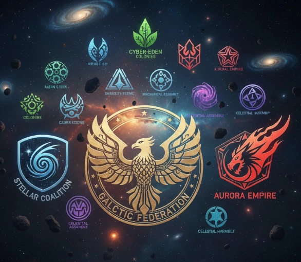
While the wordmark dominates the franchise, Star Wars also uses several sub-logos and emblems:
- Rebel Alliance starbird — stylized phoenix symbol of freedom.
- Galactic Empire cog — sharp-edged circle denoting order and control.
- Jedi Order insignia — minimalist wing-like emblem with a lightsaber core.
- Mandalorian mythosaur skull — cultural symbol of warriors and clans.
🖼️ [Insert emblem image strip with captions]
Including these adds depth to your post and invites internal linking opportunities to related topics like “Star Wars symbols explained” or “Design secrets of the Rebel logo.”
Legal and Trademark Information
The Star Wars logo is a registered trademark of Lucasfilm Ltd., now owned by The Walt Disney Company. This means:
- You cannot use the logo commercially (on products, merch, or promotions) without an official license.
- Using it for non-commercial fan art or commentary is generally tolerated, but you must include a disclaimer (“Star Wars and all related properties are trademarks of Lucasfilm Ltd.”).
- Lucasfilm provides official brand asset guidelines for licensees — always reference those before using any official artwork.
💡 Tip for creators:
If you want a similar look without copyright issues, use free alternatives like “Star Jedi”, a fan-made typeface inspired by the logo’s design.
Hidden Meanings and Easter Eggs
The Star Wars logo also hides a few fun design Easter eggs:
- The extended “S” curves at each end subtly mirror one another, symbolizing the saga’s cyclical nature — “wars” within “stars.”
- The consistent use of yellow and gold hints at the light of hope in the series.
- In promotional posters, designers often align the logo’s baseline with horizon lines or lightsaber edges — a compositional trick used since 1977.
Evolution Through the Eras
1. The Classic Trilogy (1977–1983)
Used a simple flat design. The bright yellow logo over the starry void became a pop-culture visual instantly.
2. The Prequel Trilogy (1999–2005)
Gradients, shine, and 3D effects were added to fit digital-era aesthetics. The golden hues matched the cleaner, more “Republican” world shown in the films.
3. The Disney Revival (2015–2020)
A return to minimalism — flat, bold, and optimized for streaming platforms. The red variant in The Last Jedi sparked debate for breaking tradition, symbolizing the balance between light and dark.
4. Streaming Era (2020–present)
Each show uses distinct palette tweaks (orange for The Mandalorian, violet for Ahsoka) while keeping the core wordmark unchanged — a modern example of brand flexibility with consistency.
Influence on Pop Culture & Design
The Star Wars logo has inspired thousands of parodies, re-creations, and fan projects. Designers use it as a benchmark for cinematic branding — simple enough to be memorable, strong enough to stand alone.
You’ll find nods to it in:
- LEGO Star Wars packaging
- Fortnite and LEGO Fortnite collaborations
- Family Guy and The Simpsons parody openings
- Countless fan-made posters and typographic tributes
It’s not just a logo; it’s a cultural icon that bridges film, design, and fandom.
FAQs
1. Can I use the Star Wars logo on my product?
No — it’s a trademark owned by Lucasfilm/Disney. You need a licensing agreement.
2. Can I use it in a fan video or poster?
Yes, for non-commercial creative works, but always credit and disclaim it.
3. What font is the Star Wars logo?
It’s a custom logotype inspired by Helvetica Black, refined by Suzy Rice and Joe Johnston. You can use free alternatives like Star Jedi for fan art.
4. Who designed the logo we see today?
Suzy Rice (concept), Joe Johnston (final poster version), and Dan Perri (opening crawl typography).
5. Why did The Last Jedi use a red logo?
To symbolize conflict, blood, and the darker tone of the film’s narrative.
Fun Facts You Might Not Know
- Suzy Rice wasn’t originally a Star Wars fan — she got the assignment through her ad agency.
- The logo’s shape was originally designed to fit perfectly inside a 2.35:1 widescreen aspect ratio.
- Dan Perri, who created the opening crawl, also designed the titles for Taxi Driver and Raging Bull.
- The original film’s logo was printed in Pantone 123 C yellow — close to modern web color #FFE600.
Final Thoughts: A Timeless Design That Defines a Galaxy
Nearly fifty years later, the Star Wars logo remains a masterpiece of design discipline and storytelling power. Its geometry, balance, and cultural symbolism continue to echo across generations of fans — a reminder that sometimes the simplest shapes carry the most meaning.
From Suzy Rice’s 1976 drafts to the sleek Disney+ banners today, the logo hasn’t just evolved — it’s endured, adapting to every format and every screen without losing its soul.

